Essentialware
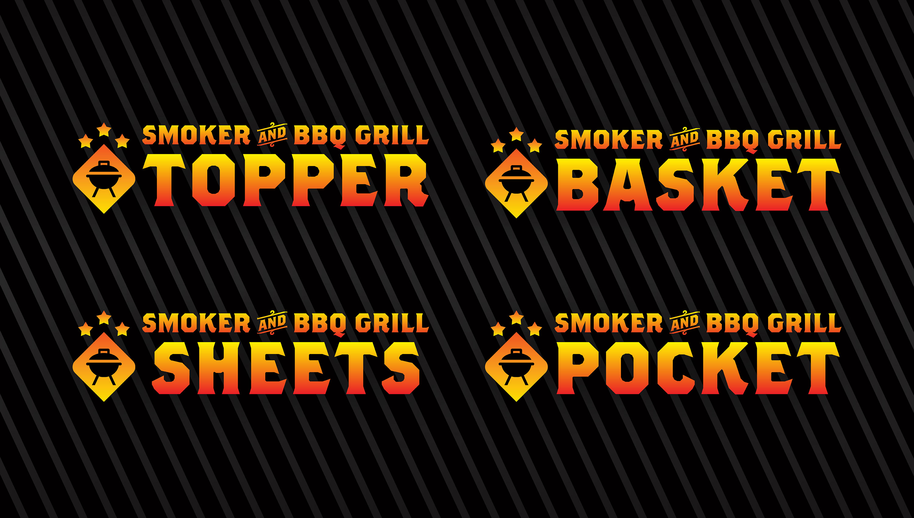
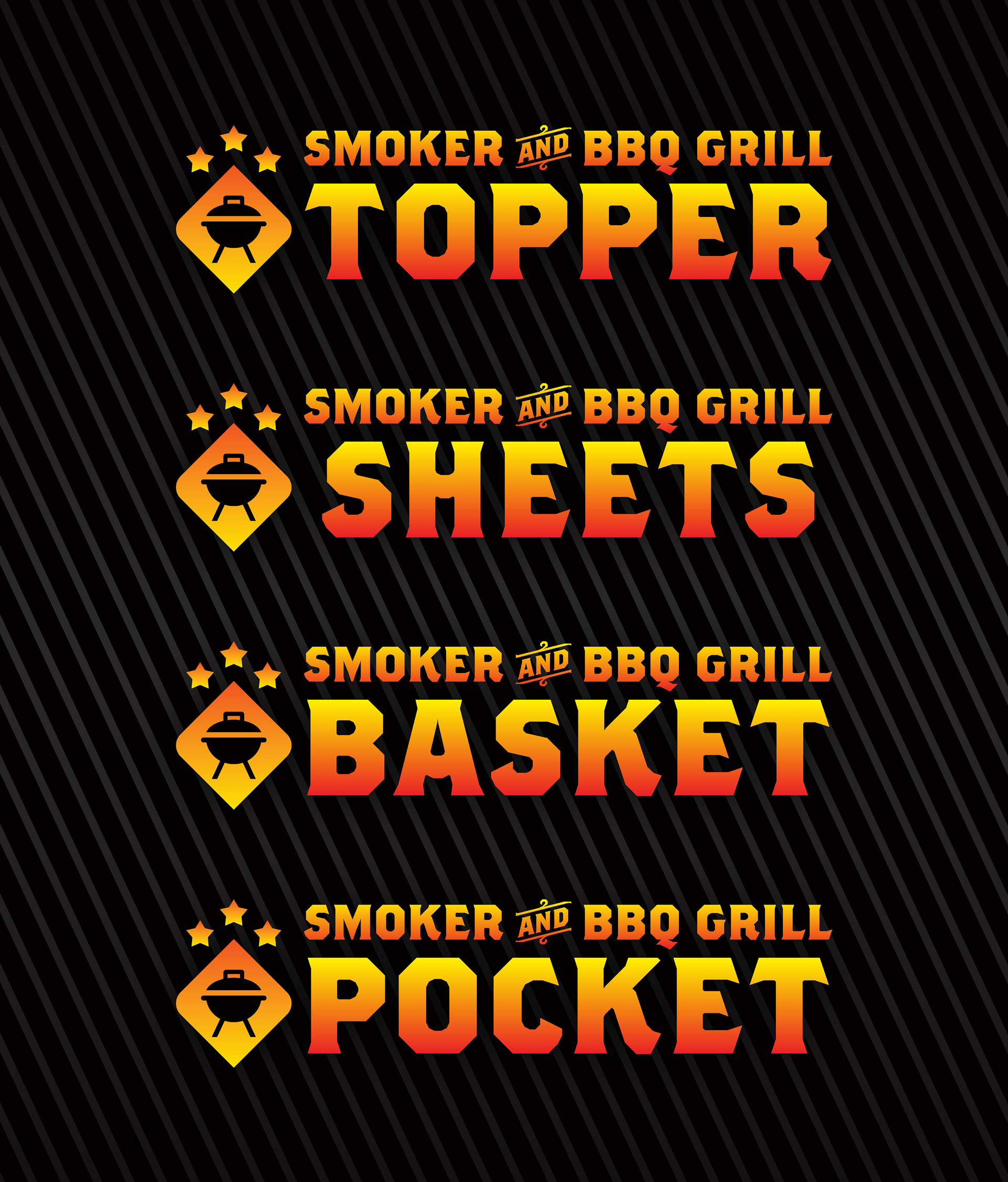
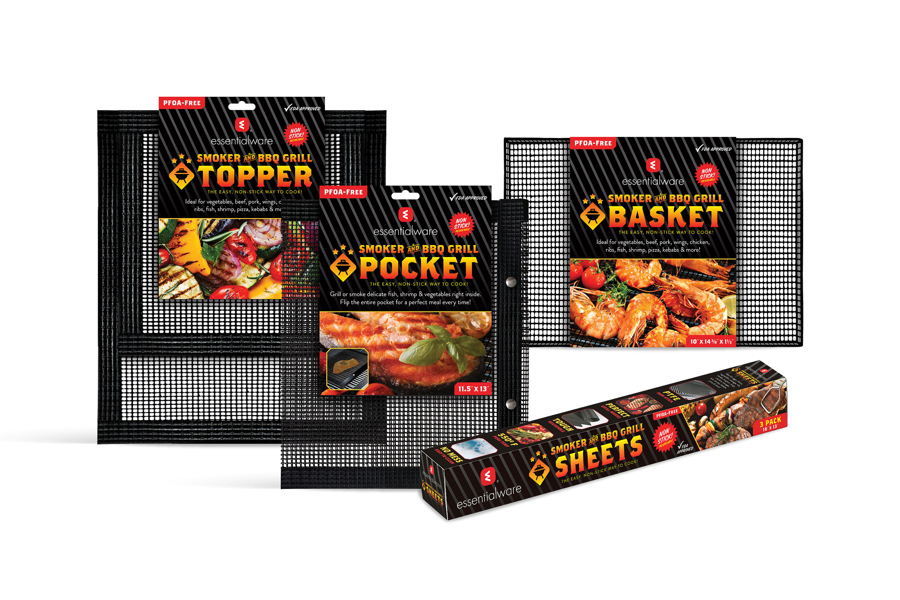
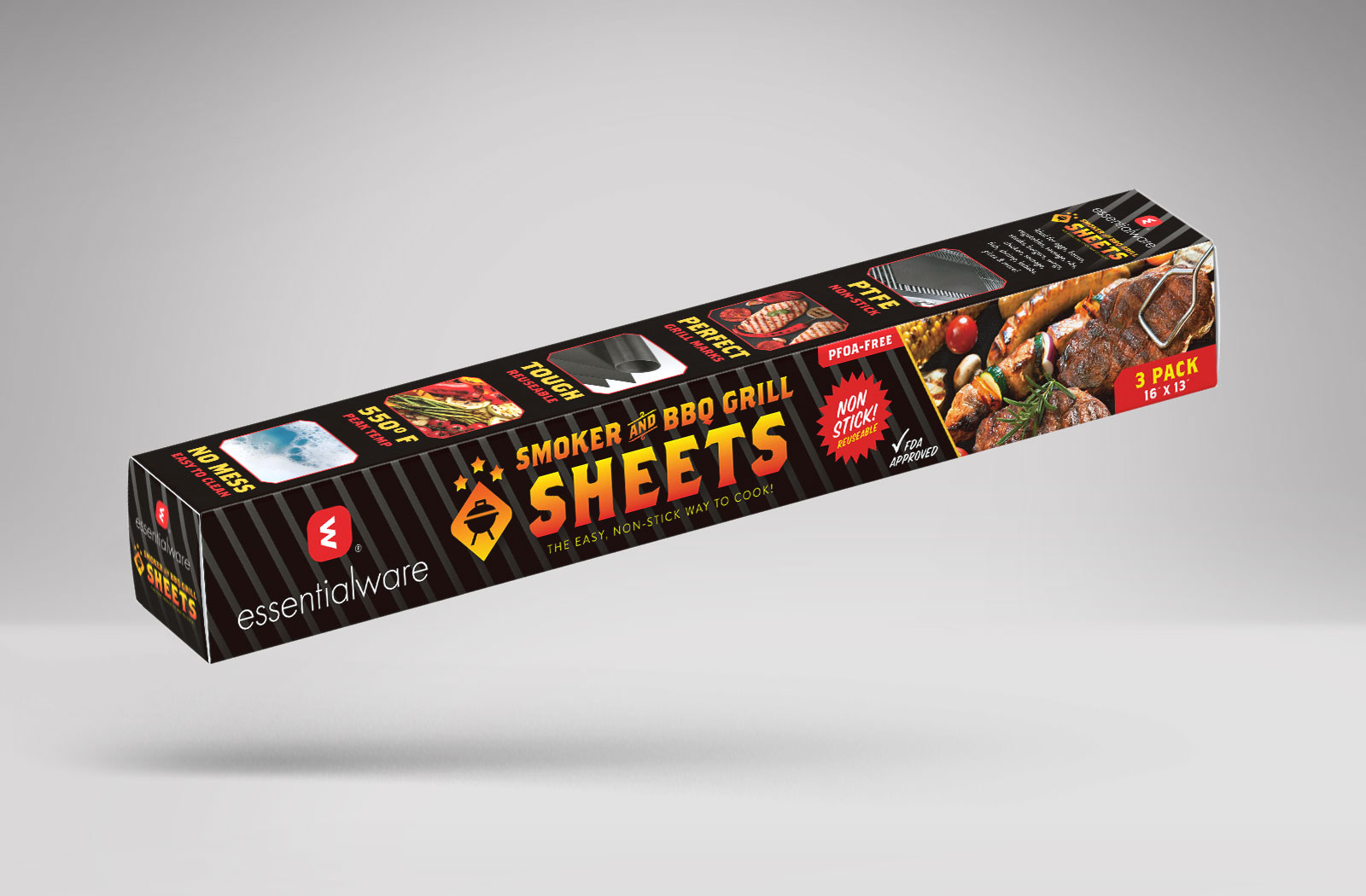
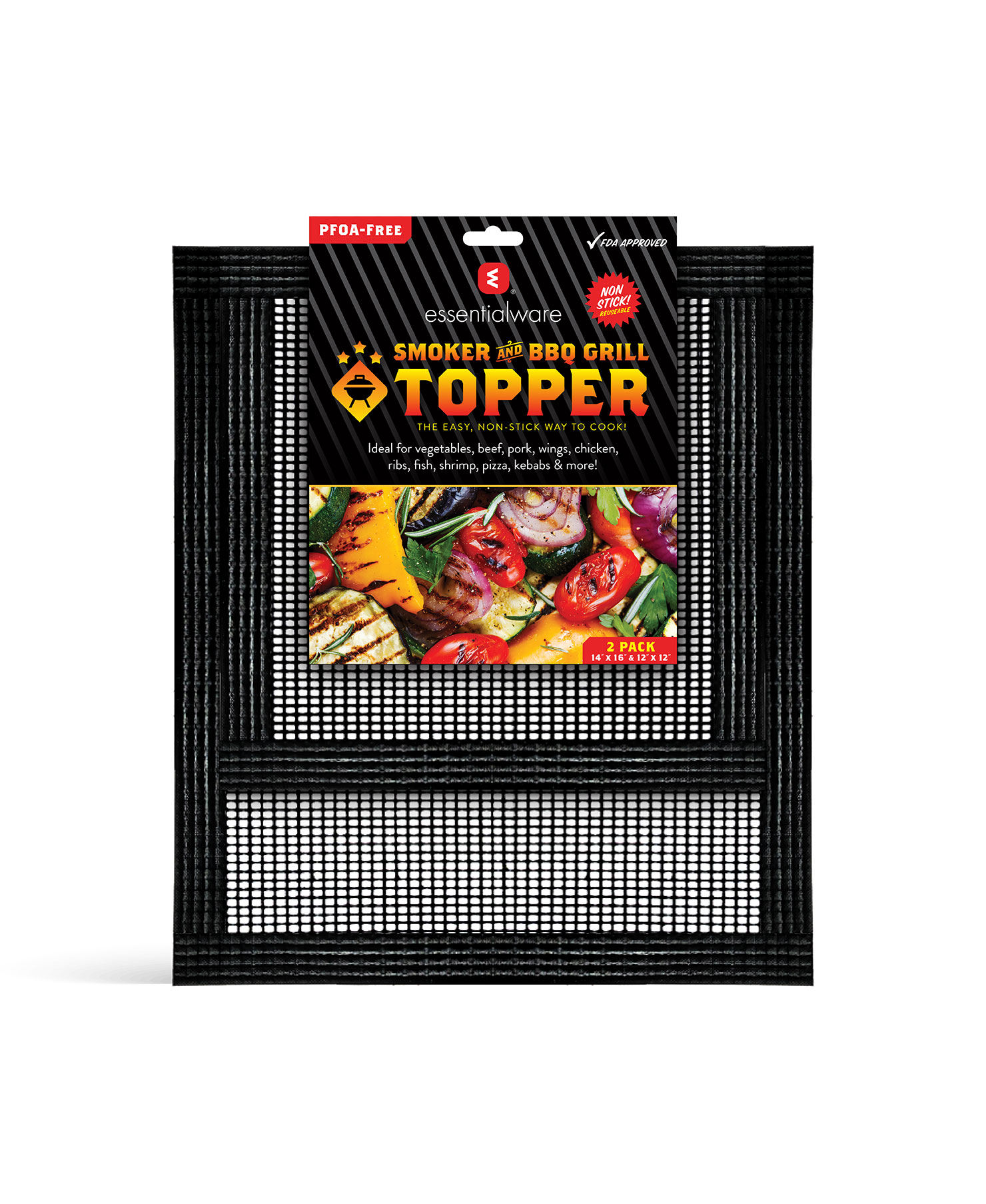
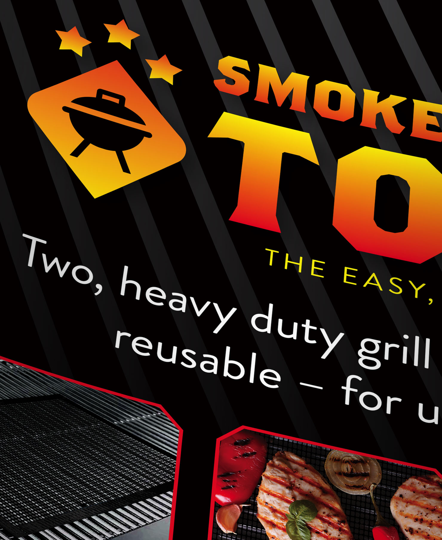
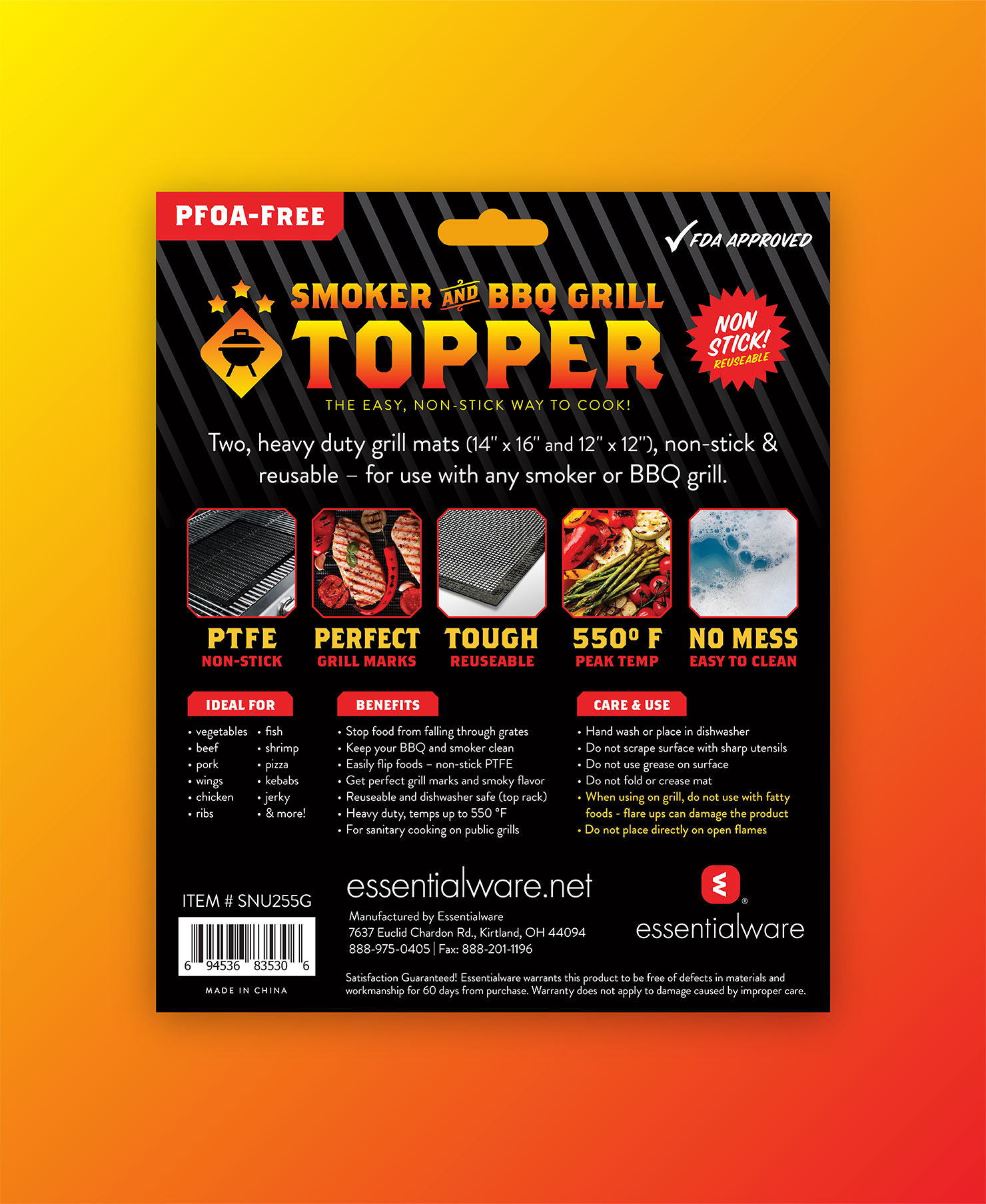
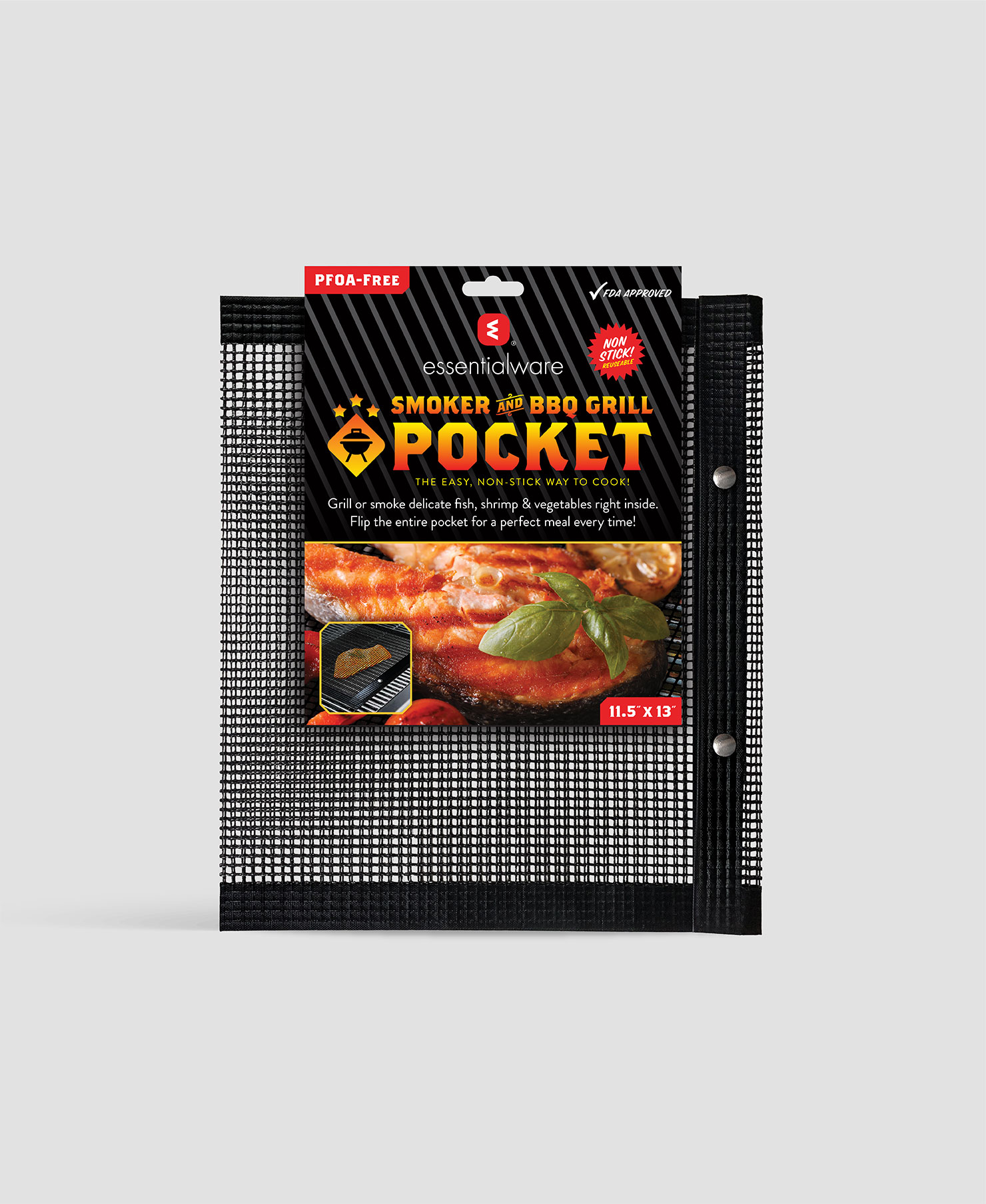
Bold typography, vibrant colors and delectable photography are key to the sub-branded identity system and product packaging we developed for Essentialware’s new retail family of non-stick grill products.
![branding](https://www.krizman.com/wp-content/uploads/2019/04/ESW-lockups-3000x17001.jpg)
![branding](https://www.krizman.com/wp-content/uploads/2019/04/ESW-lockups-molbile-1920x2250.jpg)
![family-photo](https://www.krizman.com/wp-content/uploads/2019/04/ESW-product-family-3000x2000.jpg)
![sheets-box](https://www.krizman.com/wp-content/uploads/2019/04/ESW-sheets-box-1600x1050.jpg)
Loud & Clear
We built the visual identity with a vibrant color palette to capture the spirit of outdoor cooking and, of course, catch the buyer’s attention.
![topper](https://www.krizman.com/wp-content/uploads/2019/04/ESW-topper-front-1480x1807.jpg)
![topper-closeup](https://www.krizman.com/wp-content/uploads/2019/04/ESW-topper-detail-1480x1807.jpg)
![inside](https://www.krizman.com/wp-content/uploads/2019/04/ESW-topper-back-panel-1480x1807.jpg)
![pocket-closeup](https://www.krizman.com/wp-content/uploads/2019/04/ESW-pocket-front-1480x1807.jpg)
![icon](https://www.krizman.com/wp-content/uploads/2019/04/ESW-grille-mark-1480x1807.jpg)
POP Off the Shelf!
Our goal was to create a unified brand system with instant visual appeal that showcases the convenience of the products and motivates buyers to buy.
Services Provided
Concept & DesignBrand DevelopmentArt DirectionCopywritingPackage Design